How to Reduce Churn in SaaS: Root-Cause Playbook for Every Customer Segment

Quick answer
This post provides a structured playbook for reducing churn in SaaS by first classifying root causes (voluntary vs. involuntary), then applying retention plays matched to customer segments by ARPA and behavior. It covers segment-specific interventions, a structured experimentation cycle, measurement frameworks, and guardrails to protect margin.
Quick Answer
To reduce churn in SaaS, companies need to first classify the root cause — voluntary or involuntary — then apply retention plays matched to each customer segment by ARPA and behavior. The most effective approach combines early-warning signals (usage drop, failed payments, support spikes), segment-specific interventions (automated for low-ARPA, high-touch for enterprise), and a structured experimentation cycle. Generic tactics applied uniformly across all customers waste resources and mask the real causes of churn.
Reducing churn in SaaS is less about finding a silver-bullet tactic and more about matching the right intervention to the right customer at the right moment.
A cancellation from a $29/month self-serve user and one from a $3,000/month enterprise account hit the same logo churn metric — but they demand entirely different playbooks.
This guide breaks down how to build that playbook from scratch: starting with a root-cause taxonomy, moving through segment-specific plays, and finishing with the measurement framework and guardrails that keep the strategy honest over time.
Root-Cause Taxonomy
Before running a single retention play, it’s worth understanding why customers are actually leaving.
Lumping all cancellations into a single “churn” bucket leads to misdiagnosed problems and misdirected experiments — teams end up optimizing for the wrong thing.
The two primary categories are voluntary and involuntary churn.
Voluntary churn happens when a customer actively decides to leave. The underlying reasons break into five sub-categories:
Voluntary Churn — Root Causes
| Root Cause | Early Signal | Common Example |
|---|---|---|
| Poor Product-Fit | Low feature adoption; early cancellation | User expected X, found Y |
| Onboarding Failure | Never reached the activation milestone | User never completed the first core action |
| Perceived Lack of Value | Declining login frequency over 14+ days | Can’t connect product usage to a tangible outcome |
| Competitive Displacement | Cancellation survey mentions a competitor | Switched to a cheaper or better-fit tool |
| Budget / Pricing Friction | Downgrade requests; billing change patterns | CFO squeezed the SaaS stack |
Involuntary churn happens when a payment fails without the customer intending to leave — expired cards, billing detail changes, or gateway errors.
Depending on pricing tier and billing cycle, involuntary churn accounts for 20–40% of total cancellations and is often the fastest win available to a retention team.
Understanding what is churn rate in SaaS at both the logo and revenue level is the right starting point for any root-cause analysis.
The most common sub-types of involuntary churn are worth knowing by name, because each one requires a slightly different recovery action:
Involuntary Churn — Sub-Types & Recovery Actions
| Sub-Type | Cause | Recovery Action |
|---|---|---|
| Card Expiry | Card on file expired before renewal | In-app prompt + email 7 days before expiry date |
| Soft Decline | Temporary issue — insufficient funds, bank hold | Smart retry after 24–72 hours |
| Hard Decline | Card permanently blocked or stolen | Immediate payment update request via email + in-app |
| Gateway Error | Technical failure on the processor side | Auto-retry within the same billing cycle |
| Billing Mismatch | Address or CVV doesn’t match bank records | Payment update flow with specific error message |
Knowing which sub-type is driving involuntary churn determines whether the fix is a smarter retry schedule, a better dunning sequence, or an in-app payment update prompt — three very different interventions with very different implementation costs.
Building a reason taxonomy — through cancellation surveys, exit interviews, or structured CRM tagging — transforms churn from a lagging metric into a real diagnostic tool.
Without it, every retention effort is essentially a guess.
Not sure what’s driving your churn?
Get a free walkthrough — we’ll help you map root causes by segment and identify which ones are costing you the most MRR.
Plays by Segment and ARPA
The most common mistake in churn reduction is applying the same playbook to every customer.
A high-touch, CSM-driven process doesn’t scale to a $49/month self-serve user, and an automated drip sequence won’t save a $15,000 ACV account heading toward cancellation.
Segmenting plays by ARPA (Average Revenue Per Account) creates three natural tiers:
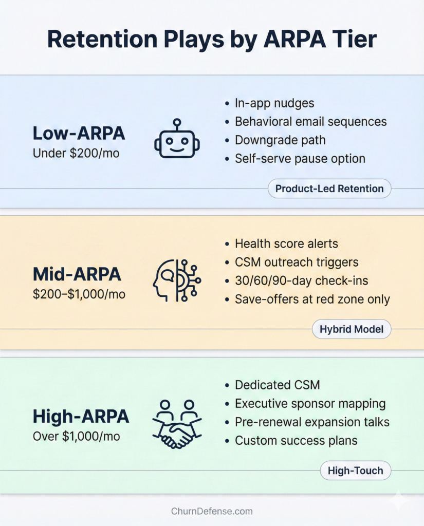
Low-ARPA (under $200/month)
These accounts need automated, product-led retention. The economics don’t support human intervention at scale, so the product itself has to do the heavy lifting:
In-app nudges tied to usage milestones and progress checklists
Behavioral email sequences triggered by inactivity (no login in 7+ days)
Frictionless downgrade paths surfaced as an alternative to full cancellation
Self-serve pause options presented within the cancellation flow
Onboarding quality is the biggest lever in this segment. Users who reach the core activation milestone within the first week churn at significantly lower rates in the following 90 days.
A structured first-week activation checklist helps engineering and growth teams pinpoint exactly where users drop off before hitting that milestone.
Mid-ARPA ($200–$1,000/month)
A hybrid model works best here. Automation handles early signals, but a human gets involved before cancellation intent is confirmed:
Health score monitoring with threshold-based alerts (usage drop >40% over 14 days)
CSM or account manager outreach triggered when a risk score crosses a defined threshold
Structured check-in cadences at 30, 60, and 90 days post-onboarding
Save-offers activated only when the health score enters the red zone — not before
High-ARPA (over $1,000/month)
Enterprise and strategic accounts require a relationship-first approach. Automation plays a supporting role, not the lead:
Dedicated Customer Success Manager with quarterly business reviews (QBRs)
Executive sponsor mapping on both sides of the relationship
Proactive expansion conversations opened before the renewal window
Custom success plans tied to the customer’s stated business outcomes
The key insight across all three tiers is that timing matters as much as the tactic itself. A save-offer shown to a customer who is still actively engaged is a wasted — and potentially damaging — move. Reviewing save-offer frameworks in detail helps teams define the precise risk threshold that should trigger each intervention.
One practical question that often comes up is when to move an account from the mid-ARPA playbook to the high-ARPA playbook. ARPA alone isn’t always the right trigger — an account that starts at $400/month but has shown 3x expansion potential deserves high-touch treatment earlier. The decision criteria worth tracking are:
Signals to Upgrade to High-Touch Treatment
| Signal | Threshold |
|---|---|
| ARPA growth trend | Account has expanded ≥ 2× in the last 6 months |
| Stakeholder count | 3+ active users from different departments |
| Strategic account flag | Product or executive team has flagged as reference customer |
| Renewal size | Upcoming renewal is ≥ $10K ACV regardless of current MRR |
On the tooling side, each tier also tends to require a different stack:
Tooling Stack by ARPA Tier
| Tier | Core Tool Category | Examples |
|---|---|---|
| Low-ARPA | Product analytics + in-app messaging | Mixpanel, Intercom, Appcues |
| Mid-ARPA | Customer health score + CSM workflow | ChurnDefense, Gainsight, Vitally |
| High-ARPA | Relationship management + QBR tracking | Salesforce, Gainsight, ChurnDefense |
The overlap at mid and high tiers is intentional — the tooling matters less than the process behind it. A health score that no one reviews on a defined cadence provides no retention value regardless of the platform running it.
Is your playbook covering all three ARPA tiers?
See how ChurnDefense maps your customer segments and surfaces the right play at the right moment — automatically.
Experiments
Most retention programs stall not because of bad ideas, but because too many tactics run simultaneously with no clear way to measure the individual impact of each one.
A structured experimentation approach fixes this quickly.
Prioritization: An ICE framework (Impact, Confidence, Ease) helps rank experiments before committing resources.
High-impact, low-effort changes — like adding a pause option to a cancellation flow — should go first.
Complex, ML-driven plays belong later in the roadmap, once the foundational wins are already in place.
Before running any experiment, writing a one-sentence hypothesis forces the team to define what success actually looks like:
“We believe that [adding a pause option to the cancellation flow] will [increase 30-day save rate by at least 15%] for [low-ARPA accounts with fewer than 90 days of tenure], because [those accounts most commonly cite budget friction as their cancellation reason].”
This format — belief, expected outcome, target segment, because — prevents the most common experiment failure: running a play on the wrong segment and drawing the wrong conclusion from the results.
Common experiments worth testing:
- Pause vs. discount at cancellation: In most SaaS contexts, a 30-day pause offer converts at equal or higher rates than a 20% discount — with zero margin impact. The reason is behavioral: customers who are leaving due to temporary budget pressure or seasonal inactivity respond to relief, not price reduction. Customers who are leaving due to poor fit respond to neither, so neither offer saves them. Running this as a 50/50 split test over 60 days, with a holdout group that sees only the existing cancellation flow, gives a clean read on which offer performs better for each reason category.
- Cancellation flow intercept: A single “what’s not working?” question before confirming cancellation generates actionable data and occasionally saves the account outright (see cancellation flow best practices).
- Onboarding email sequence A/B: Testing subject lines, send timing, and CTAs in the first-week sequence can shift activation rates in meaningful ways
- Health score threshold tuning: Finding the score that best predicts 90-day churn requires iteration — starting with usage frequency, then expanding to billing signals and support patterns
Each experiment needs a defined hypothesis, a holdout group, and a pre-agreed success metric before it launches.
Running a retention experiment without a control group is the same as not running it at all.
For teams new to experimentation design, churn prediction signals that generalize across cohorts are a useful starting point for identifying which inputs to test first.
✅ Retention Playbook Checklist
Track which plays you’ve already implemented across each segment.
0 of 20 completed
Low-ARPA Plays Under $200/mo
Set up in-app nudges tied to usage milestones and progress checklists
Configure behavioral email sequences for inactivity (7+ days no login)
Add frictionless downgrade path as alternative to full cancellation
Enable self-serve pause option within the cancellation flow
Mid-ARPA Plays $200–$1,000/mo
Configure health score monitoring with threshold-based alerts (>40% usage drop)
Define CSM outreach triggers based on risk score threshold
Schedule structured check-ins at 30, 60, and 90 days post-onboarding
Set save-offer activation rules — red zone only, never proactive
High-ARPA Plays Over $1,000/mo
Assign a dedicated CSM to each strategic account
Map executive sponsors on both sides of each relationship
Open expansion conversations before the renewal window
Build custom success plans tied to each customer’s stated outcomes
Measurement Dashboard
Configure logo churn rate tracking (monthly and annual)
Set up MRR churn dashboard with voluntary/involuntary split
Build cohort retention curves by signup month and acquisition channel
Define and track leading indicators: health score distribution and activation rate
Experiments Testing
A/B test pause vs. discount at cancellation with a holdout group
Add “what’s not working?” intercept question to the cancellation flow
Test onboarding email subject lines, send timing, and CTAs (A/B)
Calibrate health score thresholds against 90-day churn outcomes
Not sure which experiment to run first?
Get a free platform walkthrough and see how ChurnDefense prioritizes retention experiments based on your actual churn signals.
Measurement
Three metrics form the core of any churn measurement framework:
Logo Churn Rate
Logo churn rate is the percentage of customers who cancel in a given period. It’s the most intuitive number but the least actionable on its own — a 5% logo churn rate means very different things if the churned accounts were paying $50/month or $5,000/month.
MRR Churn
MRR churn measures the revenue impact of cancellations and downgrades, net of expansions from existing customers.
A company can have 8% logo churn and still report negative net MRR churn if expansion revenue outpaces cancellations — which is the ideal state for most growth-stage SaaS businesses.
Cohort Retention Curves
Cohort retention curves are the most powerful diagnostic tool in the mix.
Plotting retention by signup cohort reveals whether recent product or go-to-market changes are improving or degrading long-term retention — and which acquisition channels bring the most durable customers.
Referencing SaaS churn rate benchmarks by segment helps contextualize whether a given cohort is performing above or below industry norms.
A well-structured retention dashboard tracks all three metrics alongside leading indicators — health score distribution, activation rate, and involuntary churn recovery rate — so the team catches deterioration before it ever shows up in the monthly headline number.
Building a cohort retention curve from scratch takes four steps:
- Define the cohort unit — most SaaS teams start with monthly signup cohorts (all customers who signed up in January, February, etc.)
- Set the retention event — typically “active in the product at least once in the billing period,” though higher-engagement products might use a more specific milestone
- Plot retention at fixed intervals — 30, 60, 90, 180, and 365 days after signup for each cohort
- Layer cohorts on the same chart — this makes it immediately visible whether newer cohorts are retaining better or worse than older ones at the same tenure point
When a cohort curve starts flattening earlier than expected — say, at month 2 instead of month 4 — that’s a signal worth investigating before it becomes a trend.
Common causes are a change in the acquisition channel mix (new channels bringing lower-fit customers), a product change that disrupted an established workflow, or a pricing change that attracted a different buyer profile.
The recommended review cadence for cohort curves is monthly at the team level and quarterly at the executive level. Monthly reviews catch early signals; quarterly reviews reveal whether the interventions implemented since the last review are actually moving the curves.
SaaS Churn Rate Calculator
Enter your numbers to calculate logo churn and MRR churn instantly.
Customers (start of period)
Customers lost
MRR start ($)
MRR lost ($)
—
Monthly Logo Churn
—
Monthly MRR Churn
—
Annual Logo Churn
—
Annual MRR Churn
Tracking logo churn, MRR churn, and cohorts in one place?
See how the ChurnDefense retention dashboard surfaces all three metrics — plus leading indicators — before problems hit your bottom line.
Risks and Guardrails
Any retention playbook carries real risks when deployed without guardrails.
Discount Addiction
Offering discounts as the default save-offer trains customers to cancel just to receive one at renewal. Setting strict eligibility rules — first-time save only, minimum account tenure, no repeat offers within 12 months — protects margin and prevents the behavior from spreading across cohorts.
A practical set of discount eligibility rules that protects margin without eliminating the save-offer option entirely:
Discount Eligibility Rules — Protecting Margin
| Rule | Recommended Threshold |
|---|---|
| First-time only | No repeat discount offer within 12 months |
| Minimum tenure | Account must be at least 60 days old |
| ARPA floor | Discount only available above a defined MRR threshold |
| Reason match | Offer only when reason is budget/pricing — not competitive or poor fit |
| Approval gate | Discounts above 20% require manager approval before triggering |
Setting these rules inside the retention platform — rather than relying on CSM judgment in the moment — removes the inconsistency that tends to develop as teams scale.
Over-Intervention with Healthy Accounts
Automated outreach triggered by false-positive health score dips frustrates engaged users and desensitizes the CS team to real risk signals over time.
Auditing alert thresholds quarterly and comparing alert volume to actual churn outcomes keeps the system properly calibrated — and preserves the customer’s trust in the relationship.
Ignoring Involuntary Churn
Many teams focus exclusively on voluntary churn while leaving a significant share of recoverable revenue unaddressed.
A well-designed failed payment recovery flow — with smart retry logic, dunning email sequences, and in-app payment update prompts — typically recovers between 40–70% of would-be involuntary churners.
Comparing recovery performance against leading CS platform alternatives can reveal gaps in how payment failures are currently being handled.
A well-designed dunning sequence for failed payments typically follows this structure:
Failed Payment Recovery — Dunning Sequence
| Day | Channel | Message Focus |
|---|---|---|
| Day 0 | In-app banner | “There was an issue with your payment — update your card to keep access” |
| Day 1 | Clear subject line; direct link to payment update page | |
| Day 3 | Smart retry | Automatic retry — no customer action required |
| Day 5 | Urgency escalation — “Your account will be paused on [date]” | |
| Day 7 | Smart retry | Second automatic retry |
| Day 10 | Final notice — “Your account has been paused” + reactivation link | |
| Day 30 | Win-back email | Re-engagement offer for accounts that didn’t recover |
The difference between a dunning sequence that recovers 40% of failed payments and one that recovers 70% is usually in the specificity of the error message on day 1 and the timing of the smart retry on day 3. Generic “payment failed” emails produce generic results.
Worried your playbook is training customers to expect discounts?
Get a free churn audit — we’ll review your current save-offer rules, alert thresholds, and payment recovery flow and show exactly where the gaps are.