How to Reduce Customer Churn: The Complete Root-Cause Playbook

Quick answer
This post teaches how to reduce customer churn by diagnosing root causes (voluntary vs. involuntary), applying segment-specific plays based on ARPA, and building a measurement framework to prioritize experiments that protect margin. Its distinct goal is the complete root-cause playbook framework.
Quick Answer
To reduce customer churn, start by separating voluntary churn (the customer chose to leave) from involuntary churn (a payment failure ended the relationship). From that distinction, apply segment-specific plays: automated, product-led interventions for self-serve SaaS accounts, hybrid CSM workflows for mid-market, and relationship-first strategies for enterprise. Generic tactics applied uniformly across all segments consistently fail to address the real causes of cancellation and erode margin over time.
Reducing customer churn is one of the highest-leverage activities available to any SaaS business built on recurring revenue, and it is also one of the most frequently mismanaged.
Most teams jump to tactics before diagnosing the problem, rolling out discounts, win-back campaigns, or onboarding improvements without first identifying which root cause is actually driving cancellations.
The result is a familiar pattern: short-term saves that mask structural deterioration and, over time, train customers to expect concessions as part of the normal subscription relationship.
This guide approaches customer churn reduction differently. Instead of listing tactics, it builds the diagnostic foundation first and then maps specific interventions to specific root causes and customer segments.
Teams working on the SaaS-specific version of this playbook, including ARPA segmentation, MRR churn mechanics, and health score instrumentation, can find a deeper treatment at Reduce Churn in SaaS: Root-Cause Playbook for Every Segment.
The goal of this guide is a retention program that compounds over time rather than one that produces diminishing returns with every new campaign.
What Is Customer Churn and Why It Compounds Fast
Customer churn is the rate at which customers stop doing business with a company over a defined period. In subscription models, it is typically expressed as a percentage of total customers lost (logo churn) or a percentage of total revenue lost (MRR churn) within a month or a year.
The definition is simple, but the downstream consequences of even modest churn rates are consistently underestimated until they have already become expensive to reverse.
The reason customer churn deserves sustained, systematic attention is not the immediate revenue loss from any single cancellation.
It is the compounding dynamic that makes small increases in monthly churn rates disproportionately destructive over time, and that makes small improvements equally powerful in the opposite direction.
The Financial Cost of a 1% Increase in Monthly Churn
Consider a SaaS business with 1,000 customers and $500,000 in monthly recurring revenue. At 2% monthly churn, that business retains approximately 79% of its customer base after 12 months.
At 3% monthly churn, retention drops to 69%.
That single percentage point difference, applied consistently over a full year, represents more than 100 additional lost customers and a proportional revenue decline that compounds in every subsequent period, because the smaller base at the end of year one generates less absolute revenue even before the next year of churn is applied.
Beyond the direct revenue loss, elevated churn increases the pressure on customer acquisition to compensate for what the business is losing at the back end.
When a SaaS company is losing customers faster than it acquires new ones, top-line growth stalls regardless of how effective the sales and marketing motion is.
In this context, reducing customer churn by even a single percentage point monthly often delivers more durable revenue impact than a comparable increase in new customer acquisition, particularly in markets where CAC is rising and paid channels are becoming less efficient.
Churn Rate vs. Retention Rate: The Same Metric, Different Lens
Churn rate and retention rate measure the same underlying reality from opposite directions.
If monthly churn is 3%, monthly retention is 97%. The choice of which to track is largely a matter of organizational communication preference, but both metrics have blind spots when used in isolation.
Logo retention, for instance, can look healthy while revenue quietly erodes, when the customers who stay are consistently downsizing their plans or failing to expand.
That is why the most complete picture comes from tracking logo churn and revenue churn simultaneously, alongside leading indicators like product usage frequency, feature adoption depth, and support ticket volume.
A well-structured retention dashboard makes this relationship visible in a single view, separating voluntary from involuntary losses and surfacing cohorts that are deteriorating before cancellations appear in the headline metric.
Voluntary vs. Involuntary Churn: Why the Distinction Changes Everything
Before running a single retention play, the most important diagnostic question is deceptively simple: did the customer choose to leave, or did a payment failure end the relationship without any cancellation intent?
The answer to that question determines everything that follows, because the two categories require completely different interventions, different tooling, and different team owners within the organization.
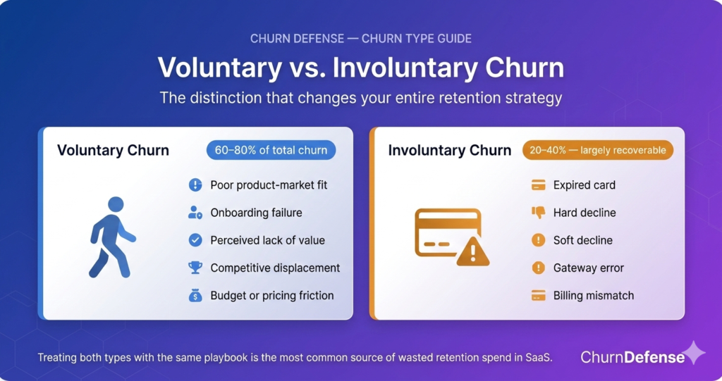
Treating voluntary and involuntary churn with the same playbook is the single most common source of wasted retention spend in SaaS businesses.
A discount offer sent to a customer whose card simply expired is irrelevant at best and confusing at worst. A dunning sequence sent to a customer who actively decided the product no longer fits their needs is equally misaligned.
The distinction is not a semantic detail; it is the foundation of every effective retention decision that follows.
Churn Type: What It Is and What Drives It
Voluntary Churn
- Poor product-market fit
- Onboarding failure
- Perceived lack of value
- Competitive displacement
- Budget or pricing friction
Involuntary Churn
- Expired card
- Hard decline (blocked card)
- Soft decline (temporary hold)
- Payment gateway error
- Billing detail mismatch
In many subscription businesses, the majority of total churn is voluntary
a smaller but significant portion is involuntary — and largely recoverable
Voluntary Churn: The Customer Chose to Leave
Voluntary churn is an active decision. The customer evaluated the product, the price, or their own situation and concluded that continuing the subscription was not worth it.
The causes vary widely across SaaS businesses, from poor product fit and onboarding failure to competitive displacement and budget pressure, but they share one defining characteristic: the customer had agency in the outcome.
Because voluntary churn is a decision, it can often be influenced before it is finalized.
Early-warning signals like declining usage frequency, reduced feature adoption depth, and an increase in support tickets about basic functionality are all observable in the product data well in advance of a cancellation event.
SaaS teams that instrument these signals into a structured health score create the ability to intervene during the decision window rather than responding after the subscription has already ended.
Involuntary Churn: The Customer Did Not Mean to Leave
Involuntary churn happens when the payment infrastructure fails without the customer intending to cancel.
Expired cards, soft declines from temporary bank holds, hard declines from stolen or blocked cards, and gateway errors are the most common sub-types in B2B SaaS billing environments.
Depending on the billing model and average contract length, involuntary churn accounts for 20 to 40% of total cancellations across most subscription businesses.
The recovery opportunity here is substantial precisely because there is no cancellation intent to overcome.
A well-designed dunning sequence, with smart retry logic, timely in-app prompts, and a clear payment update flow, typically recovers between 40 and 70% of would-be involuntary churners within a single billing cycle.
That recovery rate is rarely matched by any voluntary churn intervention, which makes involuntary churn the fastest revenue recovery opportunity available to most SaaS retention teams and, ironically, the one most frequently treated as a low-priority billing operations problem rather than a strategic retention lever.
Root-Cause Taxonomy
Knowing whether churn is voluntary or involuntary is the first diagnostic layer.
The second is identifying the specific cause within each category, because that level of precision is what separates retention programs that produce lasting results from those that cycle through tactics without improving the underlying numbers.
The most common failure at this stage is treating all voluntary churn as a single category and applying the same intervention to every at-risk customer.
A customer leaving because the product never delivered value in onboarding needs a completely different response than a customer leaving because a competitor offered a lower price.
Conflating the two wastes resources on the wrong play and, over time, produces a dataset that looks like “retention efforts don’t work” when the real problem is that the efforts were never matched to the actual cause.
The Five Causes of Voluntary Churn
Voluntary churn in B2B SaaS consistently traces back to one of five root causes, each with distinct early signals and specific matching interventions:
Poor product fit occurs when the customer’s expectations at purchase do not match the product’s actual capabilities.
Early signals include low feature adoption in the first 30 days, a high rate of support tickets asking about missing or expected functionality, and cancellations that cluster in the first 60 to 90 days of the subscription.
The fix is rarely a retention tactic; it usually starts upstream, with more precise qualification in the sales process or clearer messaging in the marketing funnel.
Onboarding failure happens when the customer never reaches the core activation milestone that generates their first genuine experience of product value.
Without that moment, the subscription fee quickly feels unjustifiable and cancellation becomes the rational response.
Users who reach the activation milestone in the first week retain at dramatically higher rates in the following 90 days, which is why a structured first-week activation checklist is among the highest-leverage retention investments available to SaaS product and growth teams.
Perceived lack of value develops gradually. The customer may have reached activation but never developed a consistent habit of using the product in ways that generate visible business outcomes.
Declining login frequency over 14 or more days, combined with low engagement with the core features, is the most reliable early signal.
The intervention is re-engagement: connecting product usage back to the business outcomes the customer originally purchased to achieve, through targeted in-app nudges, a CSM check-in, or a structured success plan review.
Competitive displacement occurs when a customer switches to a competing product because it offers a better price, a better fit, or a feature the current product lacks.
This cause is most often revealed in cancellation surveys, where customers explicitly name the tool they are moving to.
Beyond product development, the best short-term mitigation is a structured save conversation that surfaces the real objection and offers a credible response, whether that is a feature roadmap commitment, a pricing adjustment, or a genuine acknowledgment that the switch makes sense paired with an offer to make the transition easy.
Budget and pricing friction is the most situational of the five causes. It does not necessarily reflect dissatisfaction with the product; it reflects external pressure, such as a budget cut, a reorganization, or a change in procurement policy.
Customers in this category often respond well to pause options, temporary downgrade paths, or pricing restructuring, provided the offer is framed as a bridge rather than a permanent discount.
Understanding how to design that intercept point effectively is covered in detail in cancellation flow best practices for SaaS.
Voluntary Churn — Root-Cause Taxonomy
| Root Cause | Early Signal | Primary Intervention |
|---|---|---|
| Poor Product Fit | Low feature adoption in first 30 days; early cancellations (days 0–90) | Fix upstream: sales qualification + marketing messaging |
| Onboarding Failure | Never reached the activation milestone in the first week | Re-onboarding sequence; activation checklist; in-app coach marks |
| Perceived Lack of Value | Login frequency declining over 14+ days; low core feature usage | Re-engagement campaign; connect usage to business outcomes |
| Competitive Displacement | Cancellation survey mentions a specific competitor | Structured save conversation; roadmap commitment or honest release |
| Budget / Pricing Friction | Downgrade requests; billing change patterns; CFO-driven reviews | Pause option; temporary downgrade path; annual plan bridge offer |
How to Build a Reason Taxonomy from Scratch
A reason taxonomy converts the qualitative noise of customer cancellations into a structured dataset that can be analyzed, tracked over time, and mapped directly to interventions. Building one does not require sophisticated tooling; it requires consistency and a four-step process.
The first step is to add a required reason field to the cancellation flow, using a dropdown with five to seven predefined categories rather than a free-text field, which produces noise that cannot be aggregated or trended.
The second step is to tag every cancellation in the CRM with the primary reason within 24 hours of the event, creating a searchable record that builds value over time.
The third step is to review the distribution monthly, focusing on the reason that appears most frequently and carries the highest associated MRR impact.
The fourth step is to map each reason to a specific intervention so that the team’s response to budget friction is always a pause offer, the response to onboarding failure is always a re-engagement sequence, and the response to poor product fit triggers a review of the sales qualification process rather than a retention tactic.
That fourth step is what transforms the taxonomy from a reporting tool into an operational one.
Without explicit reason-to-intervention mapping, even a well-maintained taxonomy produces insights that never change the team’s behavior. With the mapping in place, every new cancellation automatically points toward the right play.
Not sure which root cause is driving your churn?
Get a free churn audit and map your root causes by segment.
Proven Ways to Reduce Churn: Plays by Segment
The most consistent failure pattern in customer churn reduction is applying the same playbook to every account regardless of value, tenure, or behavior.
A high-touch, CSM-driven intervention does not scale to a $49-per-month self-serve SaaS account. Conversely, an automated email sequence will not save a $15,000 ACV enterprise account heading toward cancellation.
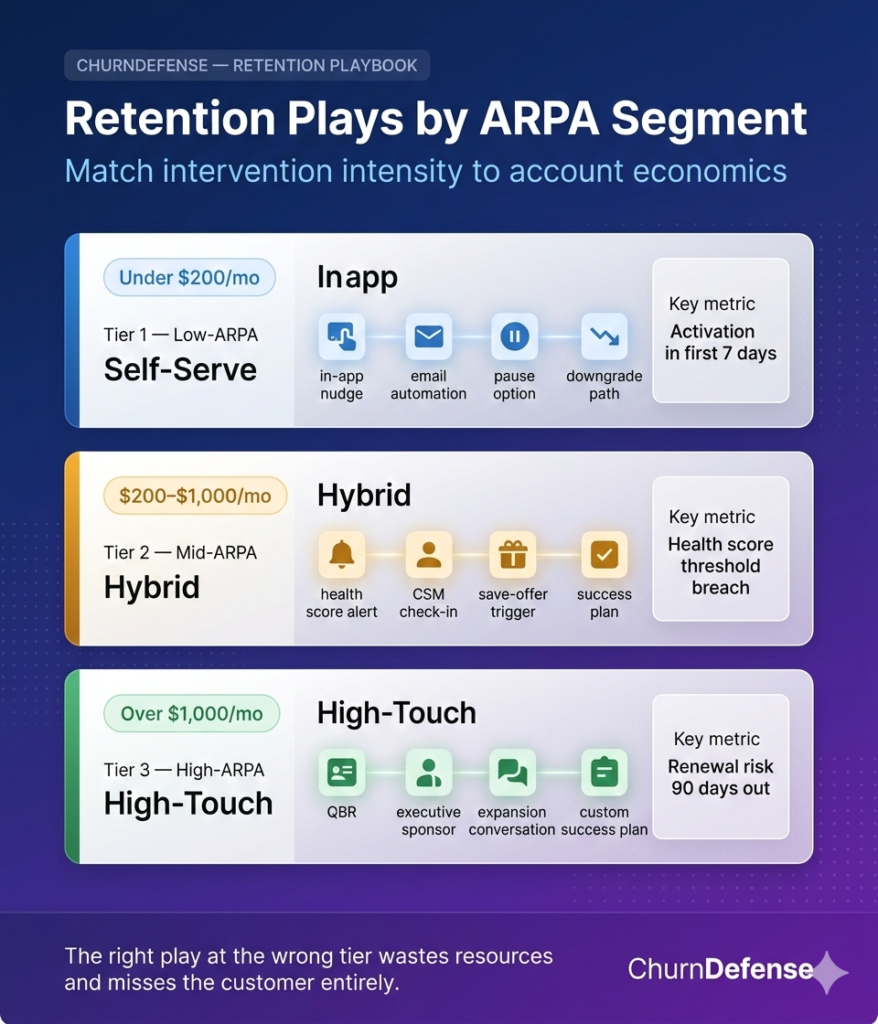
Segment-based plays solve this misallocation problem by matching intervention intensity to account economics, so that resources are deployed where the expected return justifies the cost.
The segmentation model used here is based on ARPA (average revenue per account), because ARPA is the most reliable proxy for how much human intervention a given account can economically support.
Teams working with a more detailed breakdown of these tiers in the SaaS context, including health score thresholds, tooling stack by tier, and when to escalate from mid to high-touch, can find the full treatment in how to reduce churn in SaaS.
Low-ARPA Plays (Self-Serve, Under $200 Per Month)
In the self-serve segment, the product must do most of the retention work. The economics do not support meaningful human intervention at scale, so every play in this tier is either automated, product-embedded, or both.
The goal is to build a retention motion that runs without CSM involvement while still delivering a personalized experience to each at-risk customer.
In-app nudges tied to usage milestones and progress checklists keep customers moving toward activation and beyond the critical first-week threshold.
Behavioral email sequences triggered by inactivity, typically no login in seven or more consecutive days, re-engage customers before disengagement becomes a settled habit rather than a temporary lapse.
Frictionless downgrade paths surfaced as alternatives to full cancellation convert a meaningful portion of customers who would otherwise leave entirely, preserving both the relationship and a portion of the revenue.
Self-serve pause options presented directly within the cancellation flow give temporarily disengaged customers a bridge that maintains the subscription without requiring a save conversation.
The metric that matters most in this tier is activation rate in the first seven days.
Every percentage point improvement in early activation compounds downstream into 30-day, 60-day, and 90-day retention rates, because customers who experience product value early develop usage habits that are considerably harder to break than those of customers who never fully onboarded.
Mid-ARPA Plays (Hybrid Model, $200 to $1,000 Per Month)
In the mid-range segment, automation handles early signals while a human steps in before cancellation intent has time to solidify into a decision.
The key is building the handoff point explicitly into the workflow rather than leaving it to individual CSM judgment, because judgment-based escalation is inconsistent at scale and systematically under-triggers on accounts that look healthy on the surface while quietly disengaging.
Health score monitoring with threshold-based alerts, for instance a product usage drop of more than 40% over 14 days, triggers CSM or account manager outreach at the right moment rather than after the customer has already decided to cancel.
Structured check-in cadences at 30, 60, and 90 days post-onboarding catch problems before they compound into a reason taxonomy entry.
Save-offer activation rules ensure that price-based offers are presented only when the health score enters a defined risk zone, which prevents the discount addiction pattern that develops when save-offers are shown proactively to engaged and healthy accounts.
The design of those save-offers matters as much as their timing. For mid-ARPA accounts whose cancellation reason is budget friction, a pause option almost always outperforms a percentage discount, because it delivers immediate relief without permanently reducing the subscription price or conditioning the customer to expect a discount at every renewal.
A complete framework for structuring these offers by segment, including the ethics of discounting and the guardrails that protect margin over time, is available in save-offer frameworks that actually work.
High-ARPA Plays (High-Touch, Over $1,000 Per Month)
Enterprise and strategic accounts require a fundamentally different approach, one built on relationships and shared success plans rather than automation and triggered sequences.
The plays in this tier are expensive per account but fully justified by the revenue at risk, because a single enterprise cancellation can represent more MRR impact than dozens of self-serve losses combined.
A dedicated Customer Success Manager with quarterly business reviews keeps the relationship active and surfaces risks before they escalate to cancellation intent.
Executive sponsor mapping on both sides of the relationship, meaning a named executive contact at ChurnDefense aligned with a named decision-maker at the customer, ensures that a single point of contact failure does not destabilize the entire account at renewal.
Proactive expansion conversations opened 90 or more days before the renewal window shift the customer’s frame from “should I renew this subscription” to “how do I get more value from this platform,” which changes the dynamic of the renewal discussion in a way that defensive save tactics cannot replicate.
Custom success plans tied to each customer’s stated business outcomes provide the most defensible evidence of product value at renewal time, because they translate product usage data into business language that the customer’s internal stakeholders can evaluate against their own objectives.
When a customer’s procurement team or CFO questions a renewal decision, a well-maintained success plan gives the internal champion the narrative and the numbers to make the case internally without needing to rely solely on the CS team.
Signals to Upgrade an Account to High-Touch Treatment
| Signal | Threshold to Escalate |
|---|---|
| ARPA growth trend | Account has expanded ≥ 2× in the last 6 months |
| Stakeholder count | 3+ active users from different departments |
| Strategic account flag | Product or executive team has flagged as reference customer |
| Upcoming renewal size | Renewal is ≥ $10K ACV regardless of current MRR |
Is your playbook covering all three tiers?
See how ChurnDefense maps each customer to the right play automatically.
No spreadsheets. No manual triage. Just the right intervention at the right time.
How to Prioritize Churn Reduction Experiments
Most retention programs fail not because the ideas are bad, but because too many of them run simultaneously without a structured way to measure the individual contribution of each one.
When five experiments launch at the same time without control groups, it becomes impossible to know which change moved the metric and which one had no effect or made things worse.
Prioritization and experimental discipline are what separate retention programs that improve consistently over quarters from those that plateau after the first round of quick wins.
The other failure mode is equally common: teams that never experiment at all, relying instead on best practices borrowed from conference talks or competitor teardowns without validating whether those practices apply to their specific product, segment mix, and acquisition channel.
What works for a $500-per-month product-led growth tool may produce no signal, or even a negative one, for a $2,000-per-month sales-led enterprise platform. The only way to know is to test.
The ICE Framework Applied to Retention
The ICE framework (Impact, Confidence, Ease) provides a lightweight scoring system for ranking retention experiments before committing resources to any of them.
Each experiment receives a score from one to ten on each dimension: how large the expected impact is on the primary retention metric, how confident the team is in that expectation based on existing data, and how easy the experiment is to implement given current technical and operational constraints.
The product of those three scores produces a ranking that consistently surfaces high-impact, low-effort experiments at the top and deprioritizes complex initiatives until the simpler ones are complete and their results are understood.
Applied to customer churn reduction, the ICE framework reliably surfaces a few categories of experiments as the highest-priority starting points.
Improvements to the dunning sequence for involuntary churn typically score high on all three dimensions: the impact on effective retention rate is meaningful, the confidence is high because the mechanism is well understood, and the implementation cost is low relative to the recovery upside.
Pause option additions to cancellation flows score similarly. Complex initiatives like machine learning-driven churn prediction models, on the other hand, score high on impact but consistently low on confidence and ease at the stage where most teams first consider them, which places them appropriately later in the roadmap.
Teams ready to explore predictive signal work can find a practical starting point in churn prediction signals that actually generalize, which covers the usage, billing, and support signal types that transfer most reliably across different SaaS cohorts.
ICE Score Calculator
Score your retention experiment before committing resources to it.
Impact 5
Confidence 5
Ease 5
ICE Score
125
Medium priority — validate with a small test first.
Four Experiments Worth Running First
Regardless of product type or segment mix, four experiments tend to deliver the strongest early returns in SaaS customer churn reduction programs, because they address the mechanisms that drive the highest volume of recoverable losses in most subscription businesses.
Pause versus discount at the cancellation flow
A 30-day pause offer converts at equal or higher rates than a 20% discount in most SaaS contexts, with zero margin impact and without establishing the expectation of a price reduction at every future renewal.
The mechanism is behavioral: customers leaving due to temporary budget pressure or seasonal inactivity respond to relief from the immediate obligation, not to a permanent price reduction.
Customers leaving due to poor product fit respond to neither offer, so neither wastes resources on genuinely unretainable accounts. Running this as a 50/50 split test against the existing cancellation flow, with a clean holdout group, over a minimum of 60 days produces a defensible result.
A single required question in the cancellation flow
Adding “what’s not working?” as a required dropdown before the cancellation is confirmed generates a structured reason dataset and occasionally prompts the customer to articulate a problem that a short conversation could solve.
This experiment costs almost nothing to implement, requires no product changes beyond a single form field, and produces data that improves every subsequent retention decision made in the following 12 months.
An onboarding email sequence A/B test
Subject line changes, send timing adjustments, and CTA variations in the first-week sequence can shift activation rates meaningfully without requiring any changes to the product itself.
Because activation rate in week one is the strongest leading indicator of 90-day retention in most SaaS products, even a modest improvement of three to five percentage points in activation compounds significantly across the full customer base over a quarter.
A health score threshold calibration
Finding the risk score value that most accurately predicts 90-day churn requires iteration across several months of data, but the precision it adds to outreach decisions prevents both false positives (outreach sent to healthy and engaged customers, which erodes trust) and false negatives (missed early warnings that allow at-risk accounts to reach cancellation uncontested).
Each round of calibration should compare the volume of alerts generated against the actual churn rate of alerted accounts, and tighten or loosen the threshold accordingly.
Each of these four experiments requires a defined hypothesis written before launch, a holdout group that receives no intervention, and a pre-agreed primary metric against which success is measured.
Running experiments without those three elements produces noise rather than signal, and noise is considerably more dangerous than no data because it creates false confidence in decisions that are not actually supported by evidence.
✅ Before You Launch Any Retention Experiment
Check every item before starting — missing any one of these is the most common reason experiments produce inconclusive results.
Written hypothesis: belief, expected outcome, target segment, and rationale
Holdout group defined and isolated before the experiment launches
Primary metric pre-agreed by the team (not chosen after seeing results)
Minimum runtime defined (at least 30 days, ideally 60)
Segment clearly defined — not running on all customers simultaneously
ICE score calculated and experiment ranked against current backlog
Results review date scheduled before the experiment starts
0 of 7 completed
Measurement: The Three Metrics That Actually Matter
Retention programs generate a lot of data, and most teams track more metrics than they can realistically act on.
The result is a reporting environment where every dashboard looks busy and informative but no one is quite sure which number to move or what moving it would actually require. In practice, three core metrics provide the essential diagnostic picture of customer churn health, and each one illuminates a dimension that the others miss entirely.
The goal is not to ignore every other metric; it is to establish a small set of primary metrics that own weekly attention and drive decisions, while secondary metrics serve as diagnostic tools when those primary numbers behave unexpectedly.
Logo Churn Rate
Logo churn rate is the percentage of customers who cancel in a given period. It is the most intuitive number and the one most often cited in board and investor reporting, because it is easy to explain and easy to benchmark against published industry data.
That accessibility is also its main limitation: logo churn rate is the least actionable of the three metrics in isolation, because it treats a $50-per-month self-serve cancellation and a $5,000-per-month enterprise cancellation as identical events.
A 3% monthly logo churn rate can represent a business that is managing retention well in a high-velocity, low-ARPA segment, or one that is quietly losing its most valuable accounts while retaining a long tail of low-engagement customers. Without the revenue dimension alongside it, logo churn rate alone does not tell the team where to focus.
Understanding what a healthy logo churn rate looks like for a specific business model, price point, and go-to-market motion requires context from SaaS churn rate benchmarks segmented by vertical and ARPA tier, rather than a single industry average.
MRR Churn
MRR churn measures the revenue impact of cancellations and downgrades within a period, net of expansions from existing customers.
This is the metric that most directly connects retention performance to business outcomes, because it answers the question that matters to leadership: how much recurring revenue did the company lose this month, and was that loss offset by growth from the accounts that stayed?
A business can simultaneously carry an 8% monthly logo churn rate and report negative net MRR churn, if the customers who stay are consistently upgrading their plans and expanding their usage.
That is the goal state for most growth-stage SaaS businesses: losing some customers is commercially acceptable provided the ones who remain generate increasing revenue over time, and that expansion velocity exceeds the revenue lost to cancellations and downgrades.
Tracking MRR churn separately from logo churn also surfaces a category of concentration risk that logo metrics miss entirely. When a single large enterprise account cancels, it can represent 50 times the revenue impact of a dozen small self-serve losses, yet it registers as one cancellation in the logo churn rate.
Revenue-weighted analysis catches these asymmetries and ensures that CS and product resources are allocated in proportion to actual financial exposure rather than customer count.
A well-structured executive retention dashboard separates voluntary from involuntary MRR losses, surfaces expansion versus contraction trends, and makes the concentration risk visible before it becomes a quarterly surprise.
Churn Rate Calculator
Calculate your logo churn rate, MRR churn, and projected 12-month revenue impact.
Customers at Start
Customers Lost
MRR at Start ($)
MRR Lost ($)
Monthly Logo Churn Rate
—
Monthly MRR Churn Rate
—
Customers Retained After 12 Months
—
Projected Annual MRR Loss
—
Results are estimates based on constant monthly rates. Actual results depend on expansion, acquisition, and seasonal variation.
Cohort Retention Curves
Cohort retention curves are the most powerful diagnostic tool available to SaaS retention teams, and also the most underused.
Rather than reporting a single monthly retention rate for the entire customer base, cohort analysis plots retention separately for each group of customers by their signup period, typically monthly cohorts, revealing how retention evolves over time for each distinct group and whether the business is getting better or worse at retaining customers as it scales.
The practical value of cohort curves lies in the comparisons they make possible. When a curve for the March cohort starts flattening two months earlier than the January cohort at the same tenure point, that divergence is a signal worth investigating immediately rather than waiting for it to appear in the headline monthly churn number.
Common causes include a shift in the acquisition channel mix that brought in lower-fit customers during a particular period, a product change that disrupted an established workflow for a specific user segment, or a pricing adjustment that attracted a different buyer profile with different expectations and success criteria.
Building a cohort retention curve from scratch requires four steps: defining the cohort unit (most SaaS teams start with monthly signup cohorts), setting the retention event (typically active product usage at least once within the billing period), plotting retention at fixed intervals of 30, 60, 90, 180, and 365 days after signup for each cohort, and overlaying multiple cohorts on the same chart so that improvements or deteriorations become immediately visible.
The recommended review cadence is monthly at the team level, to catch early signals before they compound, and quarterly at the executive level, to evaluate whether the retention interventions implemented since the last review are actually moving the curves in the right direction.
Want to see your cohort curves and MRR churn in one place?
See the ChurnDefense retention dashboard live, with your own data.
Logo churn, MRR churn, cohort curves and involuntary recovery rate in a single view.
Risks and Guardrails
Every retention program generates unintended consequences when deployed without explicit guardrails.
The three risks below are not hypothetical edge cases; they are patterns that appear consistently across SaaS organizations that scale retention programs without the governance structures to keep them honest.
Recognizing them early is considerably less expensive than correcting them after they have shaped customer expectations or degraded the team's ability to act on real signals.
Discount Addiction
Discount addiction develops when teams default to price reductions as the primary save-offer mechanism across all segments and cancellation reasons.
Over time, customers learn that canceling, or even signaling an intent to cancel, reliably produces a discount, so a meaningful portion of the customer base begins cycling through the cancellation flow at renewal specifically to capture the offer.
The margin impact compounds with each renewal cycle, and the behavior spreads as customers in the same industry or community share the pattern with each other.
The guardrails that prevent this outcome are eligibility rules embedded directly in the retention platform rather than left to individual CSM judgment at the moment of the save conversation.
Those rules should include at minimum: one discount offer per customer per 12-month period, a minimum account tenure of 60 days before any offer eligibility, a discount ceiling above which manager approval is required before the offer triggers, and offer eligibility restricted to accounts whose documented cancellation reason is budget or pricing friction, not competitive displacement or poor product fit, because discounting does not address either of those root causes.
Discount Eligibility Rules — Protecting Margin at Scale
| Rule | Recommended Threshold |
|---|---|
| Frequency cap | No repeat discount offer within 12 months per account |
| Minimum tenure | Account must be at least 60 days old at time of offer |
| Discount ceiling | Offers above 20% require manager approval before triggering |
| Reason eligibility | Offer only when cancellation reason is budget or pricing, not competitive or fit |
| ARPA floor | Discount path only available above a defined MRR threshold per tier |
Over-Intervention with Healthy Accounts
Automated outreach triggered by false-positive health score alerts frustrates engaged customers and erodes the CS team's credibility over time.
A customer who receives a check-in call from their CSM when they are actively using the product and expanding their usage does not experience that call as attentive service; they experience it as evidence that the vendor does not actually know what they are doing.
Enough of those interactions and the customer begins to tune out all outreach, including the outreach that arrives at a genuinely critical moment.
The operational consequence is equally damaging. A CS team that receives 200 risk alerts per week and finds that fewer than 10% of them correspond to accounts that actually churn will begin to deprioritize the alert queue entirely, which means the genuine early warnings get buried in the noise of the false positives.
The fix is a quarterly threshold audit: comparing the volume of alerts generated over the previous 90 days against the actual churn rate of alerted accounts to calculate a precision score. If the precision score is below 30%, the thresholds need to be tightened.
This audit takes a few hours per quarter and prevents months of wasted outreach capacity and misallocated CS attention.
Ignoring Involuntary Churn
The most pervasive and quietly expensive risk in customer churn reduction programs is the consistent underinvestment in involuntary churn recovery.
Because a failed payment does not feel like a retention failure in the way that a deliberate cancellation does, many SaaS teams classify involuntary churn as a billing operations problem and deprioritize it accordingly, treating dunning as a compliance function rather than a revenue recovery lever.
In practice, a SaaS business that recovers 70% of failed payments rather than 40% adds several percentage points to its effective annual retention rate with no changes to the product, the CS motion, or the customer experience.
That recovery gap is almost entirely a function of dunning sequence design: the specificity of the error message on day one, the timing and logic of the smart retry on day three, and the urgency calibration of the follow-up sequence through day ten.
Generic "payment failed" emails with no error context and no retry intelligence consistently underperform sequences that name the specific failure type and give the customer a direct, frictionless path to resolution.
Failed Payment Recovery — Full Dunning Sequence
| Day | Channel | Message Focus |
|---|---|---|
| Day 0 | In-app banner | "There was an issue with your payment — update your card to keep access" |
| Day 1 | Clear subject line with specific error type, direct link to payment update page | |
| Day 3 | Smart retry | Automatic retry with updated card logic, no customer action required |
| Day 5 | Urgency escalation: "Your account will be paused on [date]" | |
| Day 7 | Smart retry | Second automatic retry, captures delayed card updates from earlier emails |
| Day 10 | Final notice: "Your account has been paused" with clear reactivation path | |
| Day 30 | Win-back email | Re-engagement offer for accounts that did not recover through the dunning sequence |