Churn Prediction Software: Guide to Signals & ROI

Quick answer
Churn prediction software scores each customer's likelihood of canceling within 30–90 days, using signals from product usage, billing, support, and ICP fit. It ranges from simple rules-based health scores — the right fit for most teams under $5M ARR — to ML-powered platforms for larger bases with mature data infrastructure. Prediction only pays off when risk scores connect to retention playbooks and save-offer frameworks; otherwise it produces dashboards, not revenue.
Acquiring a new B2B SaaS customer routinely costs hundreds to thousands of dollars — and Paddle's ProfitWell research puts acquisition costs up roughly 60% over five years across both B2B and B2C, with established B2B categories up 70–75%.
Meanwhile, median Net Revenue Retention (NRR) across B2B SaaS sits barely above 100% in most published benchmarks, which means most companies are barely growing their base after churn.
SMB-heavy products lose 3–7% of their customers every single month. And yet, most CS and product teams still “predict” churn by scanning a spreadsheet the week before a renewal.
The problem is not awareness. Everyone knows churn is expensive. The problem is that churn prediction without a structured system — the right signals, the right tooling for your company’s stage, and playbooks connected to model output — generates dashboards, not retention.
This guide maps the full stack: which signals actually predict churn in B2B SaaS, how to choose between rules-based tools, CS platforms, and AutoML by ARR band, and how to translate a risk score into a concrete play that protects MRR. Every benchmark cited here comes from published, linkable research — not vendor claims.
Not sure which churn signals your team is already tracking — or missing? Book a free ChurnDefense demo → and we’ll map your early-warning signals live, on your own data.
What is churn prediction software?
Churn prediction software is the data layer that reads behavioral, financial, and relational signals from your customer base to estimate the probability that a given account will cancel within a defined window — typically 30, 60, or 90 days.
It is not a single category of tool. It is a function that can live inside a Customer Success platform, a product analytics suite, a billing engine, or a dedicated AutoML pipeline, depending on your data maturity and company stage.
The critical distinction that most vendor lists miss: raw analytics tools (Mixpanel, Amplitude, Heap) surface usage data, but they do not produce a risk score connected to action.
True churn prediction software combines signal ingestion, a scoring model — rules-based or ML — and integration with the workflows where CSMs, product managers, or automated sequences actually act. Without that last piece, you have a warning system with no fire department.
How does churn prediction software work?
The pipeline has three layers:
- Signal ingestion — product events (logins, feature usage, session frequency), billing data (plan tier, payment failures, contract value), support tickets (volume, CSAT, escalation flags), and CRM fields (champion role, contract stage, ICP score).
- Feature engineering and scoring — raw events are transformed into predictive features: active days per month, core actions per week, seat utilization rate, ticket-to-value ratio. A model — from a simple threshold rule to a gradient-boosted classifier — assigns a risk score or segment (green / yellow / red).
- Action layer — the score triggers a playbook: a CSM task, an automated in-app nudge, a save-offer in a cancellation flow, or a QBR request. Without this layer, the score has no economic value.
What data do you need to get started?
You do not need a data warehouse or a data scientist to begin. The minimum viable signal set for a rules-based model is:
- Usage: login frequency, days active in last 30 days, completion of at least one “core action” (the feature that correlates most strongly with retention in your product)
- Billing: current plan, MRR value, payment failure history, contract renewal date
- Support: open tickets in last 30 days, NPS or CSAT score if collected
- ICP fit: company size, industry vertical, onboarding completion status
More advanced models add feature-level usage depth, champion job-change signals from LinkedIn enrichment, and structured cancellation-reason data. But getting these four categories instrumented first typically delivers 70–80% of the predictive value.
Churn prediction vs. churn prevention
These two terms describe a sequence, not synonyms. Prediction answers: which accounts are most likely to cancel, and why? Prevention answers: what do we do about it, and when?
Most churn prediction software — especially vendor lists that rank “top 10 tools” — focuses entirely on the prediction side and treats prevention as an afterthought.
Teams that implement structured save-offer frameworks materially reduce exit churn — a 15–30% reduction is a realistic working target once flows are instrumented (see the save-offer section below). Teams that only monitor a health score dashboard without defined plays for each risk segment save virtually none of that revenue.
Churn prediction software is only an investment when it connects directly to a prevention playbook.
Key churn prediction signals for SaaS (by root cause)
The most common mistake in churn prediction is treating all at-risk accounts as the same problem. A customer churning because they never activated looks nothing like one churning because their budget was cut or their champion left.
Feeding a single generic health score to your CS team without root cause context produces the wrong plays — and burns CSM capacity on accounts that were never going to convert.
The framework below maps the five root causes of SaaS churn to specific, measurable signals. This is the input layer your churn prediction software needs to ingest before any model can generate a reliable score.
Usage and engagement signals — Low Product Engagement
Low product engagement is the single most detectable root cause before cancellation.
When onboarding fails, a large share of new SaaS users never make it past their first 90 days — and users who do not engage in their first days rarely build the habit that retention depends on. The signal window is narrow and the data is available in every product analytics stack.
Key signals to track:
- Days active (last 30): fewer than 8–10 active days in a month is a reliable lagging indicator for SMB accounts
- Core action completion: the one feature that correlates most strongly with long-term retention (varies by product — your activation metric)
- Seat utilization rate: paid seats vs. seats with at least one login in the last 30 days
- Onboarding milestone completion: checklist progress, first integration set up, first data import
- Session depth decline: not just logins, but whether the user is going past the home screen
In practice, a sustained drop of 40% or more in weekly active usage over two consecutive weeks is one of the most reliable 30-day churn signals you can instrument, regardless of company size.
Billing and payment risk — Involuntary churn
Involuntary churn — cancellations caused by failed payments rather than a deliberate decision to leave — runs at roughly 0.8–1.1% monthly in B2B SaaS, according to Vena’s 2025 benchmarks, compiled from Recurly and Paddle market data.
That is a meaningful slice that most teams undercount because it does not show up in exit surveys or cancellation flows. It simply disappears.
Key signals to track:
- Failed payment attempts in the last billing cycle (1 failure = yellow; 2+ = red)
- Card expiration date proximity (within 60 days)
- Dunning email engagement: opened but not acted on is worse than ignored — it signals awareness without intent to fix
- Subscription age vs. payment method age: a 24-month customer with a card added 36 months ago is a silent risk
- Downgrade or pause requests via billing portal
Platforms that combine dunning automation with proactive outreach — reaching out before the second failure rather than after — can realistically recover 10–20% of the MRR that would otherwise be lost to involuntary churn. Treat that range as the working target for a well-built dunning layer.
ICP and pricing fit — Poor Fit & Budget Pressure
Poor ICP fit is the root cause that prediction software detects latest, because it often looks like low engagement for months before a cancellation decision surfaces.
Budget pressure has a faster signal arc — it usually appears 30–60 days before a renewal in the form of downgrade requests, discount asks, or sudden silence from a previously active account.
Key signals to track:
- ARPA segment: customers below your median ARPA typically churn at a multiple of the rate of customers above it — segment your health scores accordingly
- Plan utilization vs. plan cost: a customer paying for 50 seats and using 12 is a budget pressure risk at every renewal
- Discount history: accounts that required >15% discount at acquisition tend to show higher churn in year two
- Support-to-value ratio: high ticket volume relative to feature adoption signals a product fit problem, not a support problem
- ICP score at signup vs. current profile: company size, vertical, or use case may have shifted since the contract was signed
Stakeholder risk — Champion Departure
Champion departure is the most underinstrumented risk signal in most SaaS stacks, yet it is one of the highest-leverage early warnings available.
When the person who drove the buying decision leaves a company — or changes roles — the replacement often does not share the same affinity for your product. Contracts become vulnerable at the next renewal cycle.
Key signals to track:
- CRM “Champion” field change or contact marked as departed
- LinkedIn job-change alerts for primary contacts (available natively in some CS platforms or via enrichment tools like Clay or Clearbit)
- Sudden drop in meeting frequency or email response rate from the primary contact
- New stakeholder onboarding activity — a new Champion who has not completed onboarding is a retention risk
- Executive sponsor engagement — absence of any senior-level contact in the last 90 days in enterprise accounts
Self-Assessment: What is your dominant churn root cause?
Use this quick diagnostic to identify where to focus your prediction and prevention effort first. Answer the five questions below; the pattern of your answers points to your dominant root cause.
1. Where does most of your churn happen?
- In the first 30–90 days after signup
- Around renewal time (month 11–13)
- Silently — accounts just disappear without contacting us
- After a contact change or reorganization on the customer side
2. What do customers most often say when they cancel?
- “We never fully implemented it” or “the team didn’t adopt it”
- “It doesn’t quite fit our workflow” or “missing a key feature”
- “Too expensive” or “budget was cut”
- They don’t say anything — we find out via a failed payment
3. What best describes your current customer base?
- Mixed — we sell to many segments and verticals
- Mostly SMB with self-serve onboarding
- Mid-market or enterprise with multiple stakeholders per account
- High volume, low ARPA — most accounts are on monthly plans
4. How would you describe product usage in churned accounts?
- Low from day one — they never really activated
- Usage dropped suddenly after a period of good engagement
- Usage was decent but they still left — said it wasn’t worth the price
- Usage was narrow — they only used 1–2 features and plateaued
5. What signal do you currently track most reliably?
- Billing and payment failures
- Login frequency and feature usage
- NPS scores and support ticket volume
- CRM contact activity and stakeholder engagement
Reading your answers: if they cluster around early-lifecycle and adoption, your dominant root cause is low product engagement; around price and budget, it is poor fit or budget pressure; around silent disappearance and failed payments, it is involuntary churn; around contact changes, it is champion departure. Match your result to the corresponding signal section above — and to the software category that addresses it below.
Do you really need ML for churn prediction?
The short answer is: probably not yet. Most B2B SaaS companies under $10M ARR generate better results from a well-calibrated rules-based health score than from a machine learning model — because the bottleneck is not prediction accuracy, it is having enough structured data and enough CSM capacity to act on alerts.
A model that is 85% accurate but connected to zero playbooks saves less MRR than a simple threshold rule that triggers a real human action.
The decision to invest in ML for churn prediction should follow a maturity ladder, not a vendor pitch.
Simple rules vs. health scores vs. ML models
Think of churn prediction sophistication as three rungs on a ladder, each requiring more data infrastructure and more operational maturity to deliver value:
Rung 1 — Rules-based triggers
Single-condition alerts: "flag any account with fewer than 3 logins in 14 days" or "alert CSM when 2+ payment failures occur in one cycle." Zero data science required.
Works well for teams under $3M ARR with a small customer base where every alert can receive a human response. The risk: too many rules create alert fatigue; no weighting means a highly engaged account with one failed payment gets the same flag as a genuinely at-risk account.
Rung 2 — Weighted health scores
Multiple signals combined into a single composite score, with weights assigned based on observed correlation with churn in your historical data. A typical model might weight core feature usage at 35%, login frequency at 20%, billing health at 25%, support load at 10%, and ICP fit at 10%.
This is the sweet spot for most SaaS companies between $3M and $20M ARR. It requires clean product event data and a quarterly review of weights as the product evolves, but no dedicated data science team.
Rung 3 — ML and AutoML models
Gradient-boosted classifiers, neural networks, or AutoML pipelines (Pecan, DataRobot, H2O.ai) that learn non-linear patterns from hundreds of features simultaneously.
These models can predict churn 60–90 days out with meaningfully higher recall than rule-based systems — but they require a data warehouse, feature engineering infrastructure, model monitoring, and enough churned accounts in the training set to generalize.
At minimum, you need 500+ churn events in your historical data before an ML model outperforms a good health score. For a ranked comparison of the five algorithm families — with data-volume thresholds by ARR stage — see our guide to machine learning algorithms for churn prediction.
When ML actually makes sense
ML-powered churn prediction earns its complexity cost when four conditions are true simultaneously:
- Base size: 500+ accounts with enough churned history to train and validate a model
- Data infrastructure: a clean data warehouse (Snowflake, BigQuery, Redshift) with product events, billing, and support data already unified
- Signal volume: more than 10–15 meaningful features per account — sequence patterns, feature-level depth, cohort behavior
- Prediction horizon: you need to see risk 60–90 days out, not just 14–30 days — a window where simple rules lose predictive power
If any of these are missing, the time investment in AutoML setup exceeds the retention gain. Start with a weighted health score, instrument your signals properly, and revisit ML when you hit $15–20M ARR.
How accurate is churn prediction in practice?
Vendor benchmarks typically cite AUROC scores of 0.80–0.92 for their models, which sounds impressive until you realize that a naive model predicting "no churn" for every account can achieve 85–90% accuracy in a base with 10% annual churn.
The metric that matters operationally is precision at the top decile — of the accounts your model flags as highest risk, what percentage actually churn within the prediction window?
A well-calibrated model in production typically lands around 60–75% precision at the top decile. That means 25–40% of your "red" accounts will not churn — and your CSM team will spend time on them anyway.
This is why the action layer matters more than marginal accuracy gains: a model with 65% precision connected to a structured playbook outperforms a model with 80% precision that produces a list no one acts on.
Churn prediction software categories (and when to use each)
Choosing churn prediction software by vendor comparison alone is the wrong starting point. The right framework starts with your ARR band, your dominant churn root cause, and your data maturity — then maps to the category that delivers the fastest time-to-value for your specific stage.
There are four functional categories. Most companies need one primary category and one supplementary tool, not a full stack of all four.
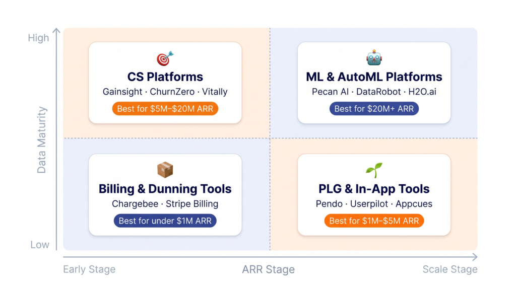
Category #1 — CS platforms with built-in churn prediction
Tools in this category: Gainsight, ChurnZero, Totango, Vitally, Catalyst
These platforms combine health score calculation, account-level playbooks, customer journey automation, and 360-degree account views in a single workspace.
Churn prediction is a native output — not a bolt-on — because the platform ingests product usage, CRM data, support tickets, and billing signals and surfaces them in a unified account health score.
When this is the right choice:
- ARR between $3M and $50M with a dedicated CS team (at least 2–3 CSMs)
- Account base where high-touch relationships drive retention (mid-market and enterprise segments)
- Need to coordinate playbooks, QBRs, renewal tracking, and risk alerts in one tool
Key limitation: implementation takes 4–12 weeks and requires clean CRM and product data pipelines.
Teams that buy a CS platform before their data is instrumented spend months on setup before seeing any churn signal value.
Category #2 — Product-led growth and in-app engagement tools
Tools in this category: Pendo, Userpilot, Appcues, Amplitude (with retention analysis), Mixpanel
These tools are built around product usage signals and in-app behavior. Their churn prediction value is strongest in the first 30–90 days of a customer's lifecycle — the window where onboarding failure drives the majority of early churn.
They excel at identifying activation gaps, triggering in-app nudges, and surfacing cohort-level patterns that predict 30-day retention.
When this is the right choice:
- PLG-led motion where the product itself is the primary retention driver
- Early-stage companies ($1M–$5M ARR) that need to reduce onboarding churn before investing in a full CS platform
- Teams where the product manager owns retention alongside (or instead of) a CS function
Key limitation: these tools are weak on billing signals and stakeholder risk. They see what happens inside the product but not what happens in the customer's finance department or org chart.
Category #3 — ML and AutoML platforms
Tools in this category: Pecan AI, DataRobot, H2O.ai, Akkio, Kumo AI
These platforms connect to your data warehouse and build custom predictive models — not just for churn, but for upsell likelihood, expansion timing, and support escalation risk. They are the highest-accuracy option and the highest-complexity option simultaneously.
When this is the right choice:
- ARR above $15–20M with a RevOps or data team that can own model maintenance
- Large account bases (1,000+ accounts) where manual CSM coverage is impossible and model-driven prioritization is necessary
- Multi-product companies where expansion prediction is as valuable as churn prevention
Key limitation: time-to-value is 2–4 months minimum. These platforms require substantial data preparation, feature engineering, and model validation before the first production score is generated. Companies that buy AutoML at $5M ARR typically abandon the implementation before it delivers value.
Category #4 — Billing and dunning tools for involuntary churn
Tools in this category: Chargebee, Stripe Billing with dunning, Chargeflow, Recharge (for subscription commerce)
Involuntary churn — failed payments — is the only root cause that is almost entirely recoverable with the right tooling.
Billing platforms with smart dunning logic retry payments at optimized intervals, send pre-expiry card update emails, and offer pause or plan-adjustment options before a hard cancellation occurs.
Well-implemented dunning sequences can recover 10–30% of the MRR that would otherwise be lost silently — a realistic working target for this layer.
When this is the right choice:
- Any company with more than 200 monthly subscribers on credit card billing
- High-volume, low-ARPA models (SMB, B2C-adjacent SaaS) where involuntary churn can represent 20–30% of total churn
- As a supplementary layer to any CS platform — even Gainsight users benefit from optimized dunning on the billing side
Key limitation: these tools only address involuntary churn. They have no visibility into voluntary cancellation risk, engagement signals, or stakeholder changes.
| ARR Band | Dominant churn drivers | Recommended category | Time-to-value |
|---|---|---|---|
| Under $1M ARR | Low engagement, involuntary churn | Rules-based alerts + dunning | 1–2 weeks |
| $1M – $5M ARR | Onboarding failure, poor fit | PLG tools + weighted health score | 2–4 weeks |
| $5M – $20M ARR | Budget pressure, champion departure | CS platform + dunning layer | 4–8 weeks |
| $20M – $50M ARR | Expansion risk, multi-stakeholder churn | CS platform + AutoML signals | 8–12 weeks |
| Above $50M ARR | Logo churn, NRR compression | Full stack: CS platform + AutoML + dunning | 12–20 weeks |
Not sure which category fits your current stage? In a ChurnDefense demo, we map your signals, benchmark your churn against your ARR band, and show you which prediction setup pays off fastest — no sales deck, just your data.
Financial impact: from churn prediction to MRR and NRR
Churn prediction software is only justifiable as a line item if the math works. This section gives you the benchmarks and a simple model to calculate whether the investment makes sense at your current ARR — and what the upside looks like if prediction connects to real retention improvement.
SaaS churn and NRR benchmarks in 2024–2026
Understanding where your churn sits relative to peers is the first step in sizing the opportunity. The variance by segment is dramatic enough that a single "average" number is meaningless without context.
According to Vena's 2025 SaaS benchmarks — compiled from Recurly and Paddle's 2025 market reports, and consistent with the SaaS churn benchmarks tracked by ChurnDefense — B2B SaaS sits at 0.3–1% monthly churn:
- B2B SaaS overall: 0.3–1% monthly churn (3.5–5% annually). A rate below 1% monthly is considered healthy for most B2B segments.
- SMB-focused SaaS: 3–7% monthly churn (30–58% annually). This is not a typo. At the upper end of that range, the average customer lifetime is under 18 months.
- Enterprise SaaS: under 1% monthly, under 10% annually. Enterprise contracts and multi-stakeholder relationships create structural retention.
- Median NRR across B2B SaaS: barely above 100% in most published benchmarks, meaning the average company barely grows its base after churn. Top performers sustain 120%+ NRR and compound meaningfully faster.
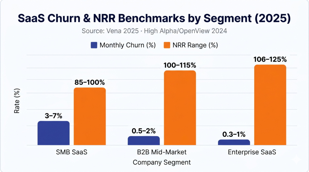
The gap between median NRR (barely above 100%) and top-decile NRR (120%+) is where churn prediction earns its keep. That gap compounds into radically different revenue trajectories over 24–36 months.
CAC vs. retention cost — why prediction matters
The cost argument for retention has never been stronger. Paddle's ProfitWell benchmarks show customer acquisition costs up roughly 60% over five years across B2B and B2C — with established B2B categories up 70–75%.
The cost of retaining an existing customer — including the tooling, CSM time, and save-offer discounts — is a fraction of what it costs to acquire a replacement.
And yet most SaaS companies still allocate the majority of their go-to-market budget to acquisition, treating retention tooling as an operational cost rather than a revenue protection investment.
The relevant comparison is not "cost of churn prediction software vs. zero spend on retention." It is "cost of churn prediction software vs. CAC required to replace the revenue lost to churn." Assume $1,000 CAC and 10% annual churn on a $5M ARR base: replacing what you lose means spending on the order of $500,000 per year just to stay flat — before any growth.
Simple ROI model for churn prediction software
The model below uses conservative assumptions. Run it against your own numbers to size the opportunity:
- ARR at risk = current ARR × annual churn rate
- ARR protected = current ARR × expected churn reduction (in percentage points)
- Net ROI (year 1) = ARR protected − annual tool cost
A classic Bain & Company insight from the mid-2000s holds that increasing retention by as little as 5% can boost profits by as much as 95% — the exact magnitude varies widely by business model, but the direction is durable.
At $5M ARR with 12% annual churn, reducing churn by just 2 percentage points protects $100,000 in ARR annually — comfortably more than the annual bill for most CS platforms or health-score tools at that stage. The math clears easily at most ARR bands above $2M.
From prediction to action: playbooks and save-offer frameworks
A churn risk score with no attached play is a weather forecast with no umbrella. This section closes the loop between model output and the actions that actually protect MRR — organized by time window and by save-offer type.
Teams that implement churn prediction software without structured playbooks tend to see little to no retention improvement in the first 12 months. The tool becomes a reporting layer, not a retention system.
Early warning playbooks by time window
Different time windows call for different interventions. Trying to run a QBR at day 7 or a lightweight nudge at day 85 before a renewal both fail — the action has to match the window.
0–7 days: Activation sprint
The highest-leverage window in the entire customer lifecycle. Users who do not complete at least one core action in their first week are dramatically more likely to be gone within 90 days. Plays for this window:
- Automated in-app checklist with progress tracking
- Day 3 email nudge if core action not completed (triggered, not batch)
- Day 7 CSM outreach for high-ARPA accounts with incomplete onboarding
8–30 days: Engagement deepening
The account activated but has not yet built a habit around the product. Plays for this window:
- Feature discovery campaign targeting the 2nd and 3rd most correlated retention features
- Automated usage report sent to the primary contact ("Here's what your team accomplished this month")
- CSM check-in call for any account where seat utilization is below 40%
31–90 days: Fit and value confirmation
The window where poor-fit accounts begin to disengage and budget-pressure accounts start exploring alternatives. Plays for this window:
- Value review meeting (not a QBR — a focused 20-minute conversation on ROI to date)
- ICP re-qualification: does this account still fit your target profile? If not, flag for managed offboarding rather than save-offer spend
- NPS or CSAT micro-survey with a direct response workflow for detractors
60–90 days before renewal: Renewal risk mitigation
The window where champion departure and budget pressure surface most acutely. Plays for this window:
- Executive sponsor outreach for any account without senior-level engagement in 90 days
- Renewal health score review: flag any account below threshold for a dedicated renewal call
- Proactive plan right-sizing conversation for accounts using less than 60% of their contracted capacity
Save-offer frameworks powered by churn scores
When an at-risk account reaches a cancellation intent signal — whether through a cancellation flow, a direct request to the CSM, or a health score drop below your red threshold — the save-offer hierarchy determines what you offer and in what order.
The hierarchy matters because the wrong offer at the wrong moment destroys more value than no offer. Offering a 20% discount to an account that was going to renew anyway trains your entire base to threaten cancellation at renewal time.
The save-offer hierarchy:
- Pause — offer the ability to pause the subscription for 30–60 days rather than cancel. Cancel-flow analyses consistently suggest that a large share of customers who arrive intending to cancel will take a pause if offered one, and that pause options meaningfully reduce final cancellations. This is the highest-value save because it costs nothing and recovers the full MRR when the account reactivates.
- Downgrade — offer a lower-tier plan that preserves the relationship at reduced MRR. This is preferable to a discount on the current plan because it resets the pricing anchor and reduces the likelihood of the same negotiation at the next renewal.
- Discount — offer a one-cycle price reduction as a last resort. Maximum 20% for one billing cycle. Never stack discounts across consecutive renewals. Limit to one save-offer per account per 12 months.
Guardrails that prevent save-offer abuse:
- Require a churn score above your red threshold before any save-offer is triggered — no speculative discounts for yellow-zone accounts
- Document every save-offer in your CRM with the root cause that triggered it
- Measure save-rate at 90 days, not at the moment of offer acceptance — an account that accepts a pause and never reactivates is not a save
Teams using structured cancel flows with this hierarchy can realistically target a 15–30% reduction in exit churn — and cancel-flow analyses consistently find that problem-solving save offers outperform discount-only offers several times over.
For a deeper breakdown of cancellation flow design and save-offer sequencing, see our guide on how to reduce churn rate in the voluntary churn hub.
Measuring success: the metrics that matter
Once playbooks and save-offers are running, these are the four numbers that tell you whether your churn prediction system is working:
| Metric | Working target | Why it matters |
|---|---|---|
| Save rate | 15–25% | Share of accounts entering a cancellation flow that you keep. Measure at 90 days post-offer, not at acceptance. |
| 90-day retention post save-offer | Above 70% | Accounts saved but churning within 90 days signal a poor-fit problem, not a save-offer success. |
| NRR delta (6-month) | +3–8 pp | Expected NRR improvement in the first two quarters after structured playbooks are operational. |
| MRR recovered (involuntary) | 10–30% | MRR recovered from failed payments with optimized dunning — the fastest win in any churn prediction stack. |
Conclusion
The companies that consistently outperform on NRR are not the ones with the most sophisticated ML model.
They are the ones that instrument the right signals early, match their tooling to their ARR stage and dominant root cause, and connect every churn risk score to a specific play — an activation nudge, a value review, a pause offer, or a renewal conversation.
Churn prediction software is not a category you buy once and benefit from passively. It is an operating system that requires signal quality, model calibration, and playbook discipline to deliver the retention improvement the math promises.
The working targets are clear: a 15–30% reduction in exit churn from structured cancel flows, 10–30% of involuntary-churn MRR recovered through optimized dunning, and a 3–8 point NRR improvement in the first two quarters after playbooks are operational.
The right starting point is not a vendor comparison. It is an honest audit of which root causes are driving your churn today and which signals you are already collecting. Everything else follows from that diagnosis.
Retention Playbook Review — free. Want a working playbook instead of another dashboard? Use your ChurnDefense demo as a Retention Playbook Review: we'll map your signals to plays, set save-offer guardrails for your ARR band, and benchmark your churn against 2025 data — live, on your numbers.